Divvy Case Study

Creating a solution to better help Gen Z students budget their money.

Overview

Launch UX Bootcamp Project:

This Project was completed through the Launch program. Launch is an intensive project based 16 week program aimed at giving students training in areas such as design thinking and creating design artifacts in Figma and Sketch.
Role: Co-UX designer, along with partner Tien Tran.

Location: Remote

Brief: Go through the design process, recording all findings, to develop a high fidelity prototype of an app that encourages Gen Z college students to budget.

Problem Statement

How might we design web and mobile app that allows Gen Z college students to create a monthly budget and track their spending?

User Research

  • 8 Gen Z Participants
    • 6 UVA College Students
    • 2 Recently Graduated UVA Alumni
We believed that interviewing both people in college and recently graduated students would allow us to get a better understanding of what students currently do and what those who recently graduated wish they did to help them better transition to a more financially independent lifestyle. It is also important to note that the interviewees ranged in experience from very financially independent to more dependent on the family to deal with financial matters.
Target Users: Gen Z college students

Interview Types Conducted

  • Ethnographic to get a better sense of how users navigate existing budgeting apps.
  • Non-directed to understand users feelings towards money and their habits when it comes to spending and saving.

Ethnographic

How were these interviews conducted?

We conducted 4 ethnographic interviews that revolved around users trying to navigate two apps that were similar in design and purpose (Buddy and EveryDollar) to what we were trying to achieve. The main takeaways we wanted to get from conducting these interviews were a sense of which features are beneficial and valuable to users in a money tracking app and what we can do better to target our specific user class. In preparation for these interviews, my partner and I sat down, each one of us assigned to one of the apps and tried to explore the main purpose and functionalities of the app. We saw what was most interesting to us and took inspiration from what we thought was important. We then created open-ended navigation questions that would take the users through making a budget and give us an insight into how a user would use the app intuitively. We used zoom as a way for users to share their screens and to observe actions. Since this project was done in quarantine, it was difficult to observe smaller interactions and comments that the user had so we really relied on the users being verbal about what they were doing and thinking.

What questions were asked to our users?

  • Could you show me how to make a new budget for August?
  • Could you walk me through the process of adding an item to the food category?
  • Could you walk me through submitting a transaction?
  • Could you show me how you would change your income amount?
  • Could you show me how you would delete an item?
  • Could you show me how you would make the church item a monthly item?
  • Could you walk me through how you would set a due date for an item?
  • What features did you find most useful?
  • Would you or would you not use this app and why?

What did we learn from this expereince?

The main takeaways that we got from doing these interviews were that the structure of these apps were intuitive, especially when the goals were adding a transaction and creating a budget for various lengths. We also found that some buttons and the way they were displayed did not relay the correct message to users, this allowed us to be more cautious of what icons we used as well as making sure everything looked clickable.
Something we found interesting was that each user had a different way they navigate and perform certain actions, for example, delete, some users found a button that helped them perform the actions while some opted for swiping on an item and deleting through there. Ultimately when asked whether they would use the apps most people said no because it does what an excel sheet would do or its more convenient to keep mental notes. This got us thinking about a subproblem to our problem statement, how could we make this app more meaningful for gen z students to use and that would be better integrated into their lifestyle.

Non-directed

How were these interviews conducted?

Alongside the ethnographic interviews we also conducted 4 non-directed interviews with the purpose of understanding the core reasons why college students save and choose not to save. We wanted to get a better grasp of the user mindset to create something that will be useful in their lives. The questions asked here were also open-ended and broad. Some of the best insight we got weren't even from these questions but from the conversations and stories that came about from them.

What questions were asked to our users?

  • How do you normally budget your money?
  • Have you used any tools to help? If so explain
  • When was the last time you had to save up for something or to pay off something?
  • What did you do to meet this goal?
  • What are some key factors that go into making your budget? (like rent, water, etc.)
  • Can you list out your monthly/yearly expenses from most priority to least and why they are in that order?
  • What are your main reasons for keeping a budget?
  • How far in advance do you budget?
  • Is there any particular reason for this?

What did we learn from this experience?

From these questions, we were able to understand users’ current habits and how those came to be. We also used these questions as a bridge to allow users to share personal stories of money in their lives and how it was handled growing up. Some things we found insightful in these conversations included that many people use their bank apps to keep track of money since they deem it trustworthy and convenient for tracking expenses on their card. Another insight is that the students we interviewed, many had their parents take care of finances for them, being a “good spender” is something that they were never taught. The way parents would help them budget when growing up included a golden rule of not spending money when they don’t need to instead of providing healthy spending habits. Finally, many students felt more inclined to keep track of money if they had goals and persistent guidance since it was never an active part of their life before.

Use Case and Journey Map

After talking to our target users Tien and I took the time to make use cases and a journey map for our persona Corey to walk through what a normal navigation process would look like with our app. This helped us understand the overarching goals that we believe our users would want to work towards and the different ways they could do that through an app. We then created a flowchart to connect these ideas together and start thinking about the necessary elements in our app.

Design Decisions

After going getting a clear understanding of our target users needs and how that could be solved through technology, Tien and I developed principles that would drive the design of our app.
  • Aim for familiar and convenient designs.
  • Create a trustworthy image to mitigate fear of using 3rd party money management apps.
  • Put emphasis around teaching valuable financial literacy skills to build healthy long-term money spending habits.

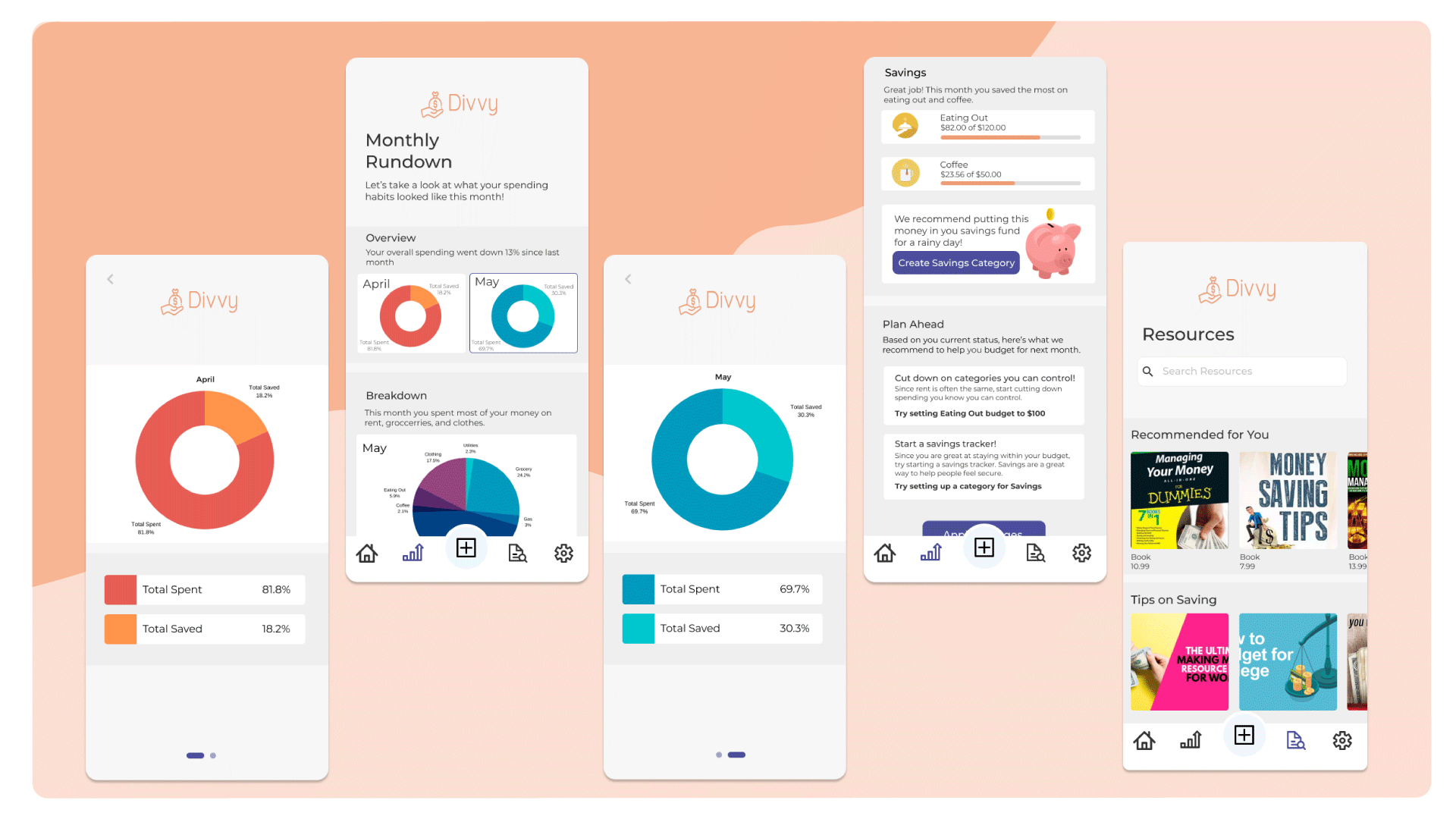
Final Solution

Secure and convenient on boarding.
Simple and familiar
budgeting interactions.
Analytics and guidance focused on building healthy spending and saving habits.